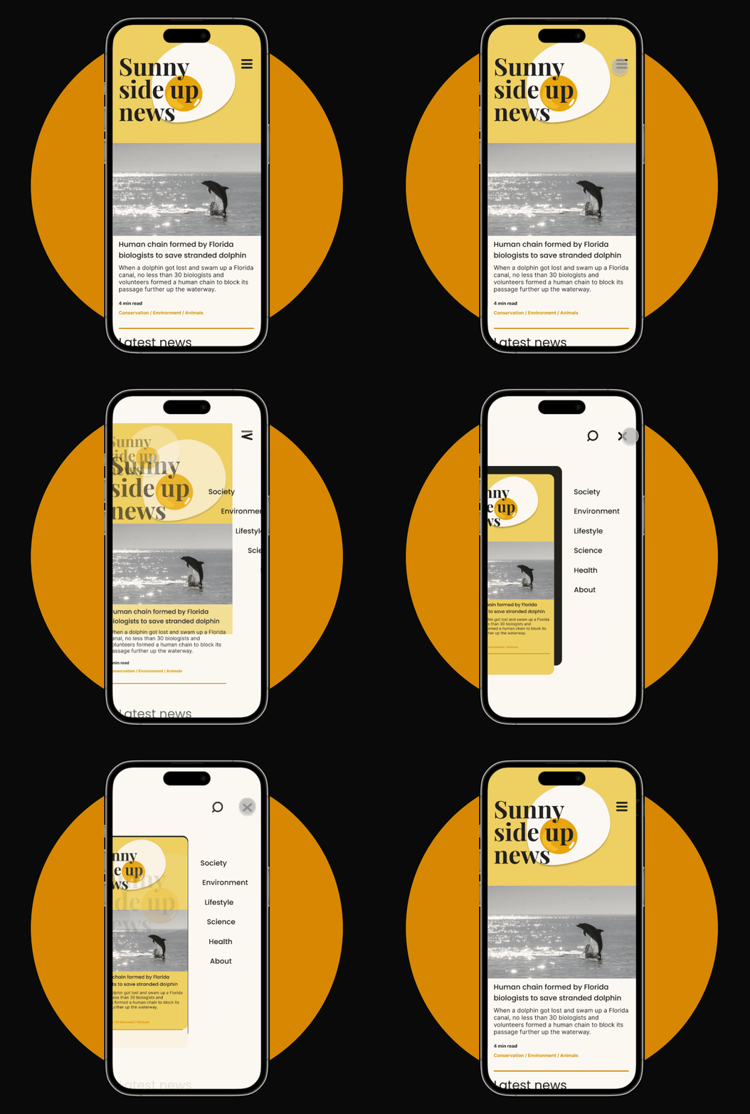
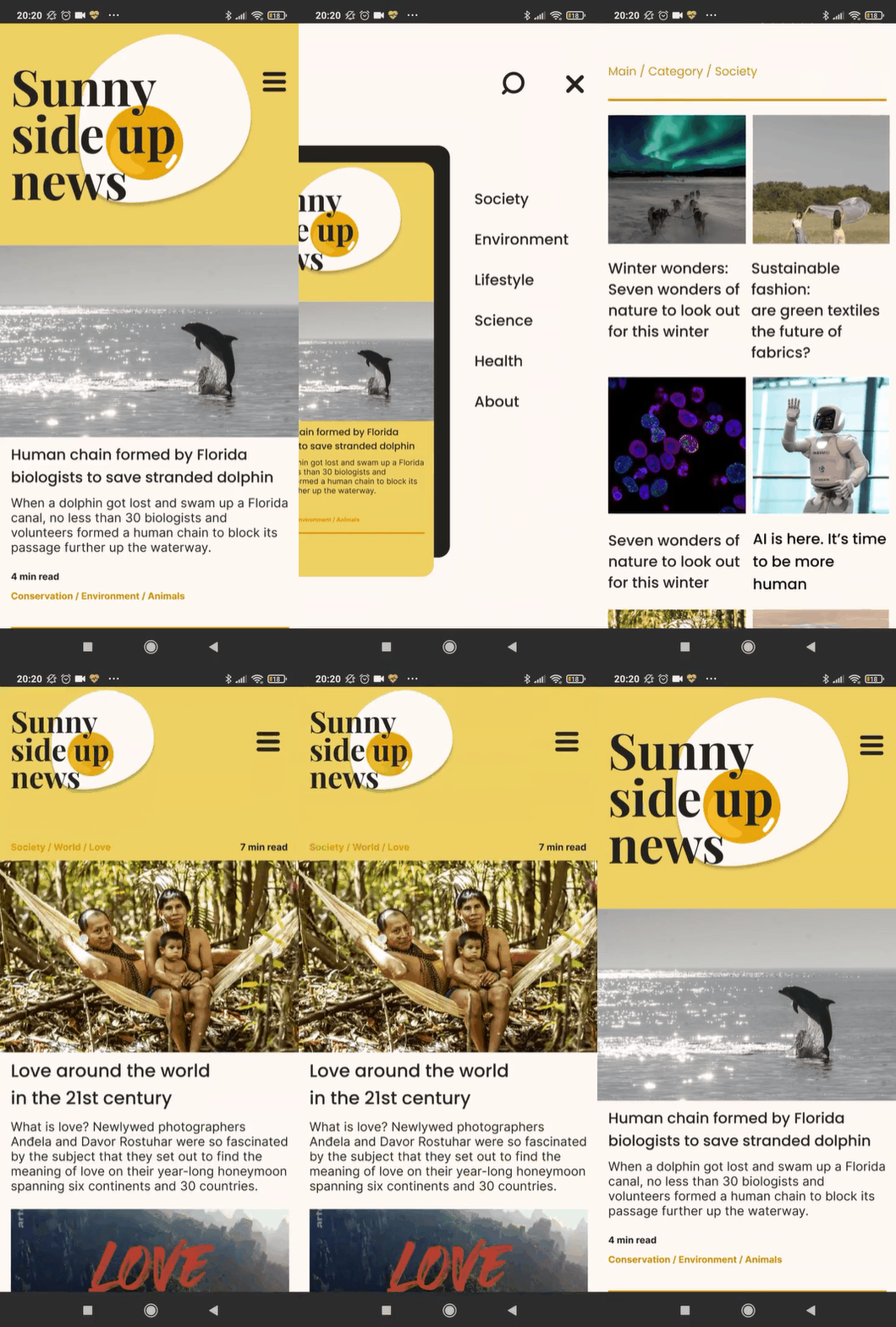
UI Concept
Good news only
Mobile prototype
This concept was developed as part of an assignment at Algebra University.
The module we were studying at that time was prototyping and the basics of animation using Figma.


I conducted a brief competitive analysis of similar good news only websites.
I concluded that most websites and portals that exclusively share positive news have outdated and highly static user interfaces, predominantly in the colors commonly associated with regular news portals.
I named my website "Sunny Side Up" and opted for a color scheme that truly reflected the uplifting and positive nature of the content.
By selecting warmer colors, I aimed to create a visually appealing and engaging user interface that would enhance the overall experience for visitors seeking positive news.
